Somar
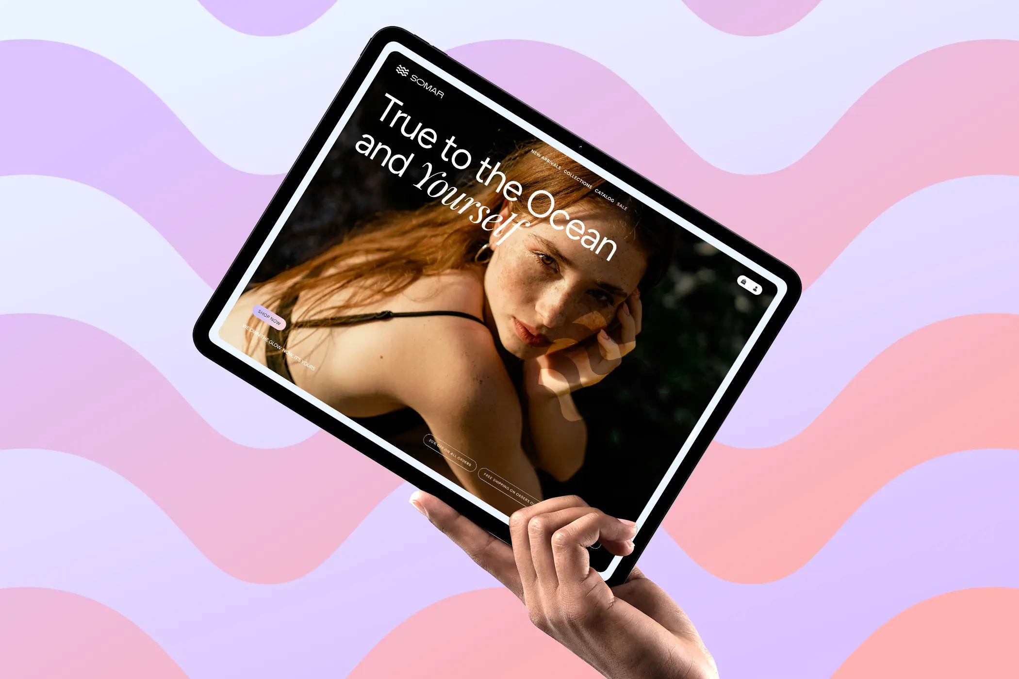
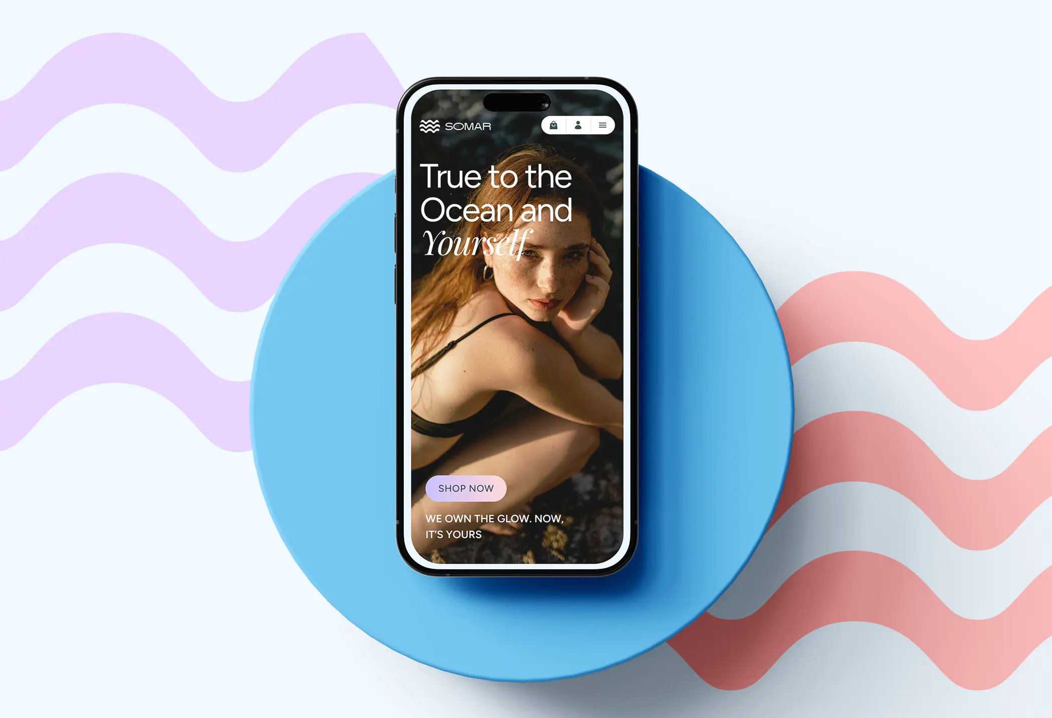
Brand identity and website design for a sea-inspired skincare brand for young women, blending soft coastal tones with a playful, feminine visual language that feels fresh, intimate and effortlessly summery.
Overview
Somar is a skincare brand for young women, built around the sea — the logo draws from ocean waves, and the palette pulls from sand, water, and sky. The visual language borrows from all of it: soft, coastal, and distinctly feminine.
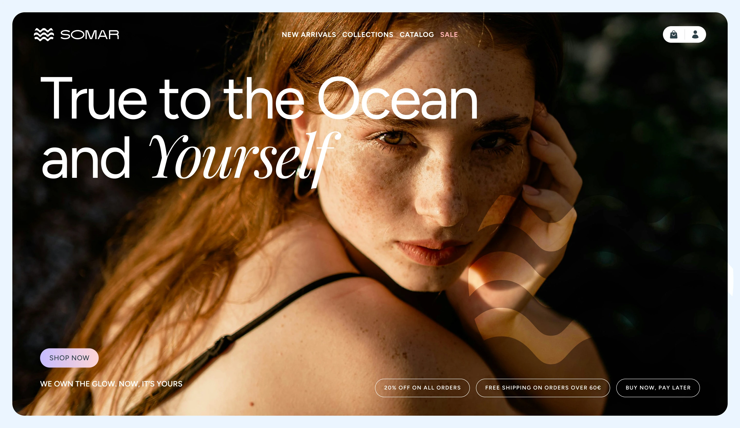
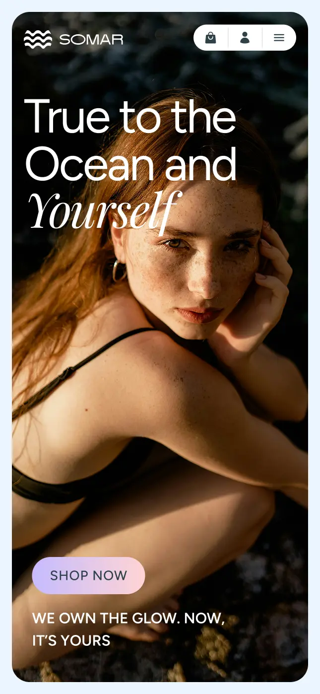
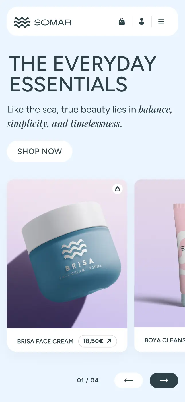
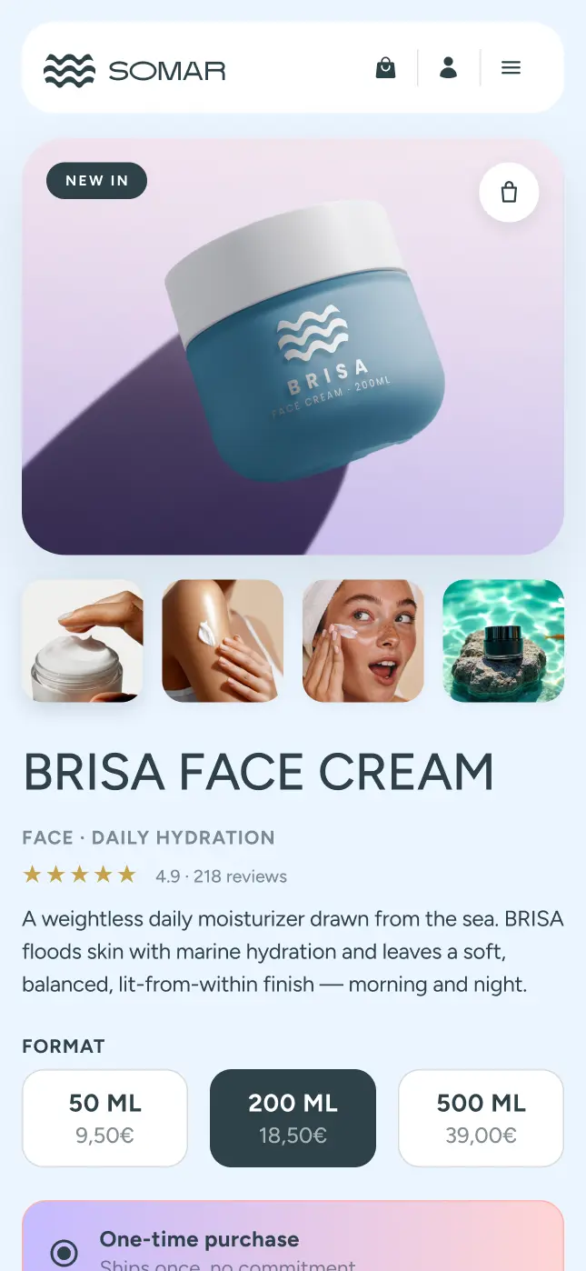
The work covered brand identity and the core ecommerce experience: homepage and product page. The goal was to design something youthful and feminine without going over the top, and broad enough to speak to women from their teens to their late thirties.
The Challenge
Skincare brands, especially in the clean beauty space, tend to default to white space, neutral palettes, and minimal layouts. This makes most brands look interchangeable online. For Somar, built around a specific aesthetic identity, going that route would have erased everything distinctive about it.
The challenge was to carry the sea theme consistently through the full ecommerce experience without it feeling decorative or surface-level, the kind of brand direction that works on a mood board but falls apart on an actual product page.
As a Visual Designer, my goal was to:
- Design a homepage and product page that feel as considered as the brand identity
- Make sure the sea theme is woven through the experience, not just applied on top
- Keep the two pages cohesive
- Balance brand storytelling with a shopping experience that is still clear and easy to use
Discovery & Strategy
Research Focus
Looking at how skincare brands communicate online revealed a consistent pattern: most rely on clinical language, clean layouts, and neutral palettes to signal quality and trust. It works as a convention, but it leaves little room for a brand personality to come through.
- Most skincare brands lead with product benefits, not with a feeling or a world the customer wants to be part of
- Sea-inspired aesthetics are rare in the category, brands that draw from nature tend to lean toward botanicals, earth tones, or sterile minimalism
- Young women increasingly relate to skincare as a ritual and a lifestyle, not just a product purchase
- Brands that build a recognisable visual identity beyond the packaging tend to feel more memorable and more shareable
Target Audiences
- Young women aged 16–24 who relate to skincare as part of their aesthetic and are drawn to brands that feel shareable and visually distinct
- Women in their mid-twenties to late thirties who want something feminine and lifestyle-driven without it feeling clinical or cold
- Skincare enthusiasts who care as much about how a brand looks and feels as what the products actually do

Typography
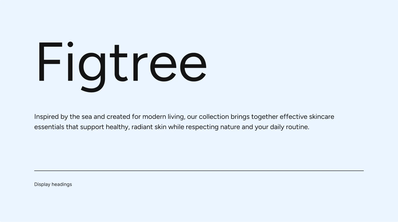
Figtree handles everything structural, headings, body copy, navigation, product descriptions. It is a rounded geometric sans-serif with a quiet friendliness to it, readable without being cold and youthful without feeling immature. For a brand speaking to a wide age range, that balance matters.
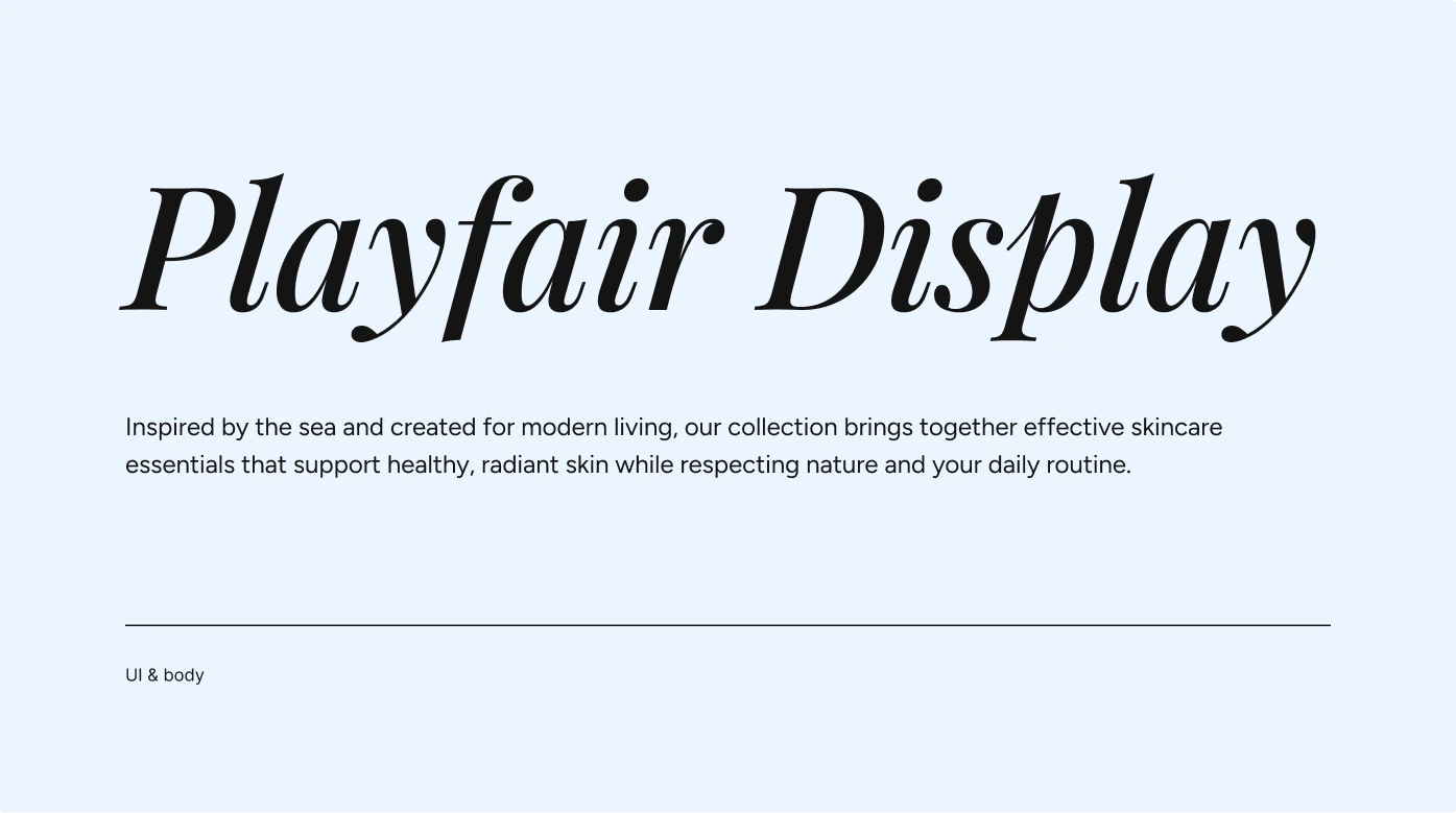
Playfair Display italic comes in selectively, used on certain words as a decorative accent rather than a workhorse. Its high-contrast curves and editorial weight bring a feminine, almost handwritten quality to the moments it appears, a small detail that adds a lot of character without taking over.
The brand
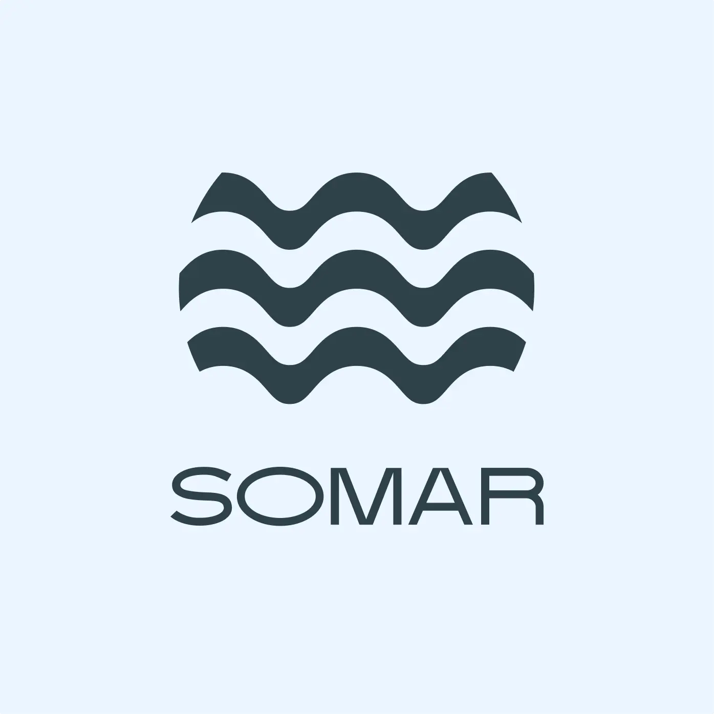
The name has “mar”, the Spanish and Portuguese word for sea, built into it from the start. Not as a tagline or a logo device, but as the foundation the whole identity grows from. The logo follows the same logic: its form is drawn from ocean waves, flowing and rhythmic, feminine without being decorative for its own sake.
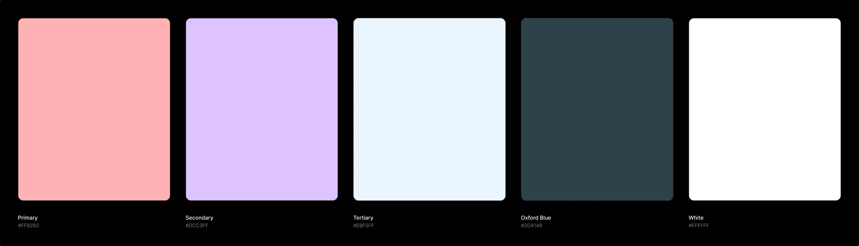
The colour palette maps to what you actually see at the shore. The soft lavender of the sky before sunrise. The blush of light on sand. The pale blue of open water. The deep teal of the sea at depth. None of the colours were chosen in isolation, they hold together because they belong together, the way those elements do in nature.
Outcome
Somar was a good exercise in restraint. The sea is an easy theme to overuse. Getting it right meant keeping the references measured: a palette that suggests the shore without announcing it, a logo that moves like a wave without spelling it out, a typeface accent that adds femininity without making it the whole personality.
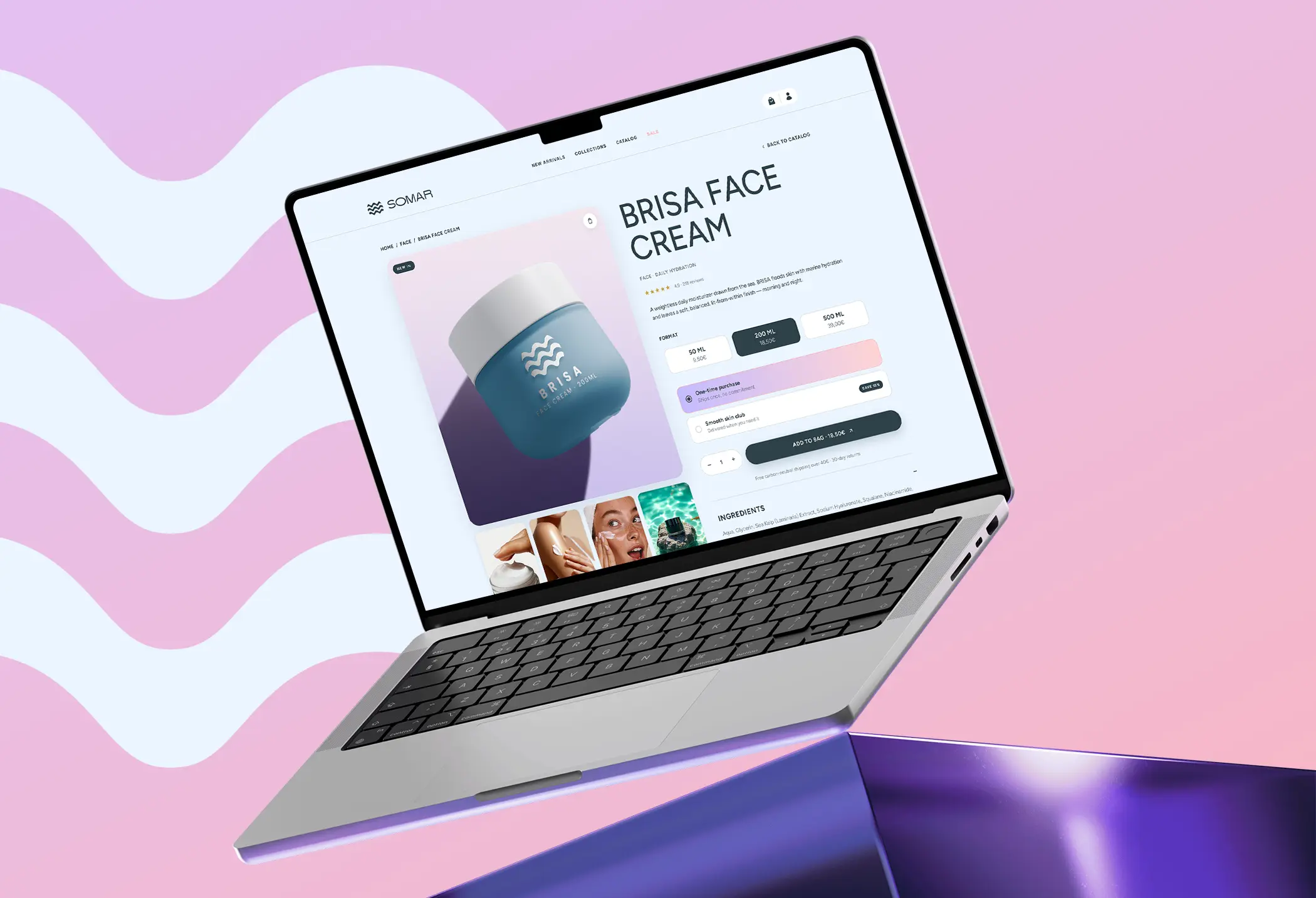
The ecommerce side mattered as much as the identity. A brand that looks great on a poster but falls apart on a product page is not really a brand. Making the homepage and product page feel continuous was what tied the whole thing together.