Paffuto
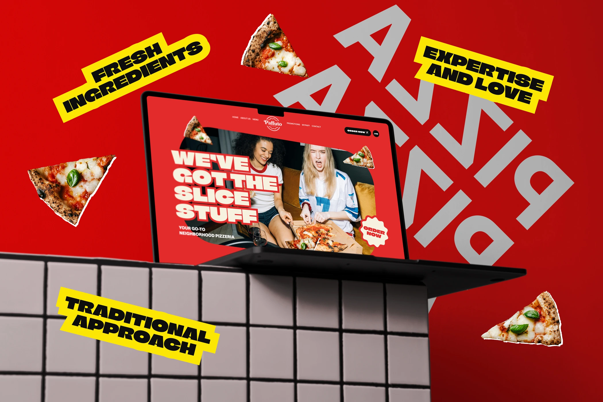
Brand identity and website design for Paffuto, a neighborhood pizzeria that needed a digital presence as bold and warm as the food they serve.
Overview
Paffuto is a local neighborhood pizzeria aiming to increase online orders, improve brand perception and streamline the customer journey from discovery to checkout.
The goal of this project was to design a modern, intuitive website that reflects the warmth of a traditional pizzeria while delivering a seamless digital experience.
The Challenge
Local pizzerias like Paffuto often struggle to translate their in-store experience into the digital space. While the food quality and brand personality may be strong offline, their online presence is frequently fragmented, outdated or overly simplistic.
The challenge: How might we design a digital experience for Paffuto that simplifies decision-making, streamlines the ordering journey and communicates the brand’s personality in a modern, visually compelling way, while catering to diverse user needs, from first-time visitors to loyal repeat customers?
Goals
As a Visual Designer, the goal was to:
- Create a cohesive and recognizable brand experience across all digital touchpoints
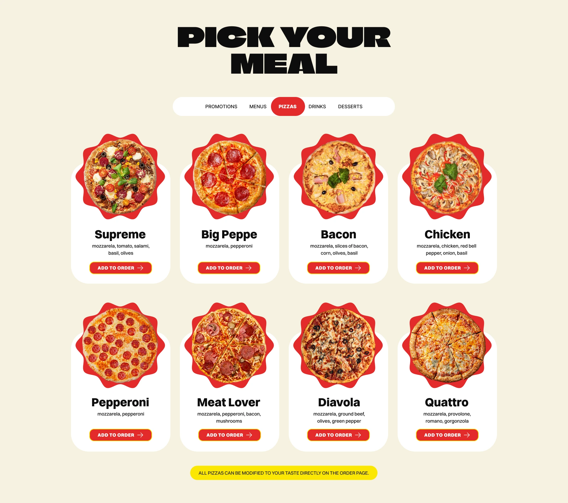
- Highlight key offerings such as bestsellers, deals and customization options
- Reinforce trust through clarity, transparency and consistency in the interface
Typography
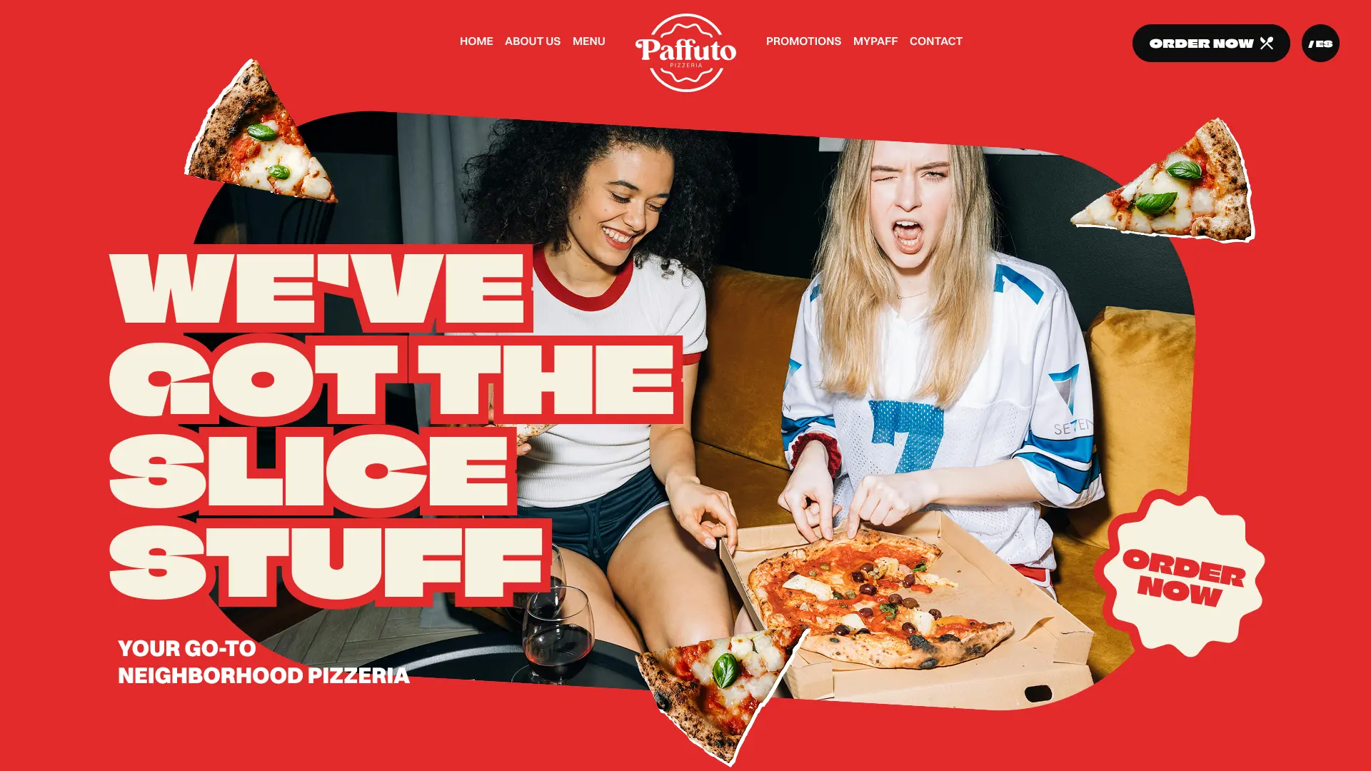
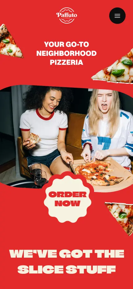
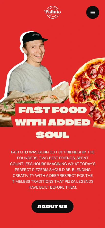
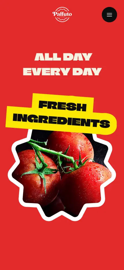
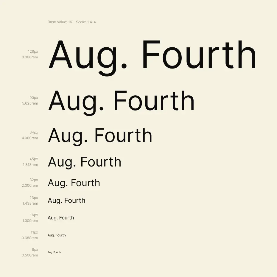
The typeface selection was anything but accidental. Climate Crisis is a variable display font which became the backbone of the visual identity, showcasing a fun and modern digital experience. Paired with a clean, readable sans-serif for body text and UI elements, the system balances personality with function. The type doesn’t just label things, it sets a mood.

The brand
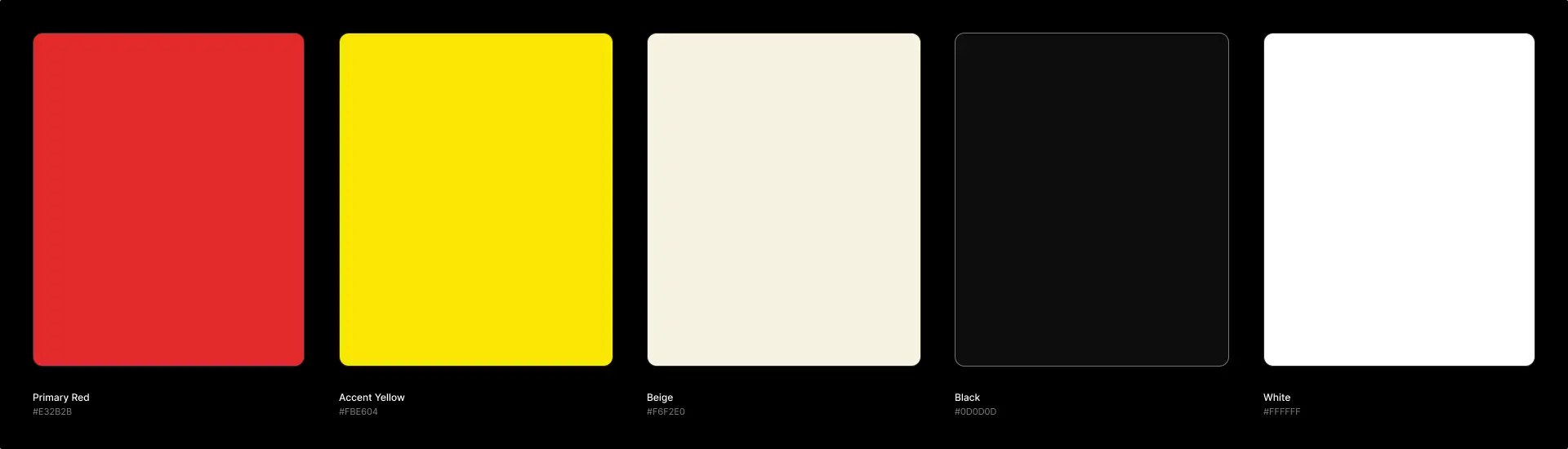
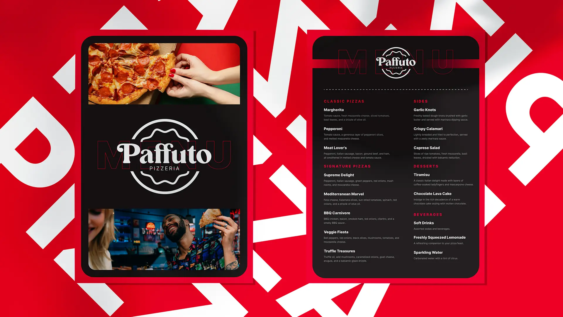
A great restaurant brand doesn’t stop at the logo. For Paffuto, consistency was the goal across every surface, from the website header to the menu cards. The warm colour palette, the bold typographic choices and the editorial photography style all speak the same visual language. Whether you’re browsing on your phone or walking past the storefront, it feels like the same place.
User flow
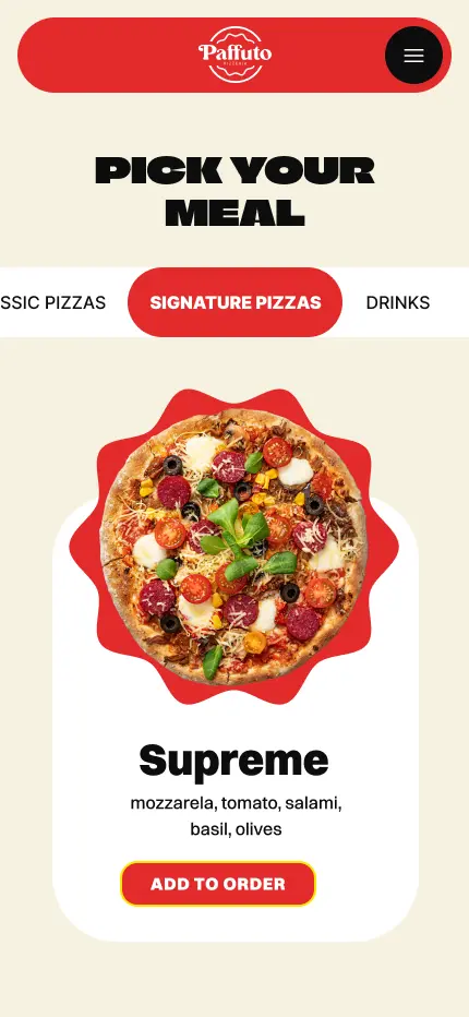
Ordering pizza online shouldn’t be a struggle. The user flow was designed with one priority: get people from craving to checkout without friction. A sticky menu, a persistent cart, and prominent calls-to-action at every scroll depth keep the path forward obvious.
Personality
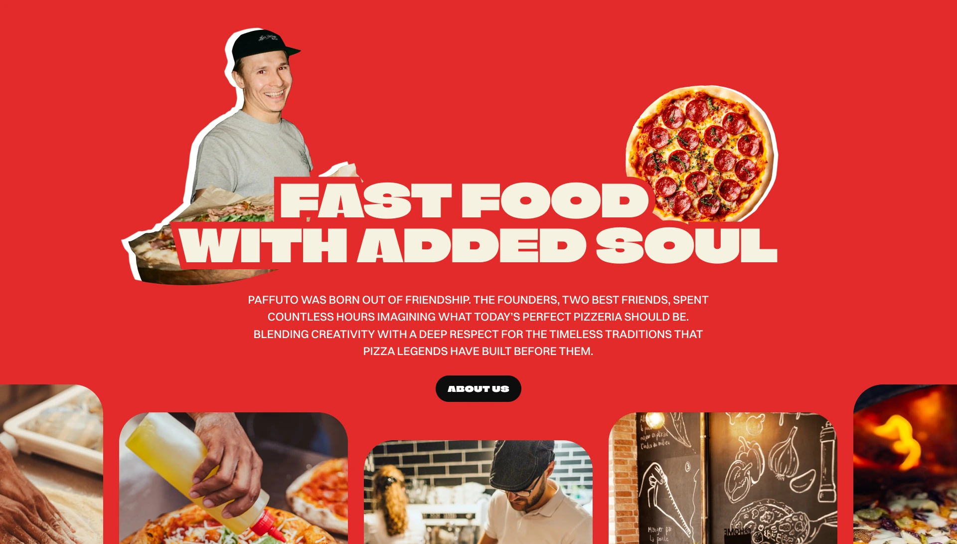
Paffuto has a story worth telling. The design makes room for it, through an “About us” section that nods to the traditions behind the recipes, editorial imagery that makes the food feel almost tangible and copy that sounds like a person, not a corporation. The tone is confident but inviting, the kind of voice you’d expect from someone who genuinely loves what they make.
Outcome
Paffuto pushed me to think beyond conventional UI patterns and commit fully to a brand personality. Using a variable display typeface as the structural backbone of the design gave the project a distinctive quality that a standard heading font simply couldn’t achieve.
The biggest challenge was balancing visual boldness with usability, particularly in the menu and ordering sections, where the high-energy aesthetic had to give way to clear product hierarchy and frictionless CTAs.